Understanding SC 1.4.10: Reflow (Level AA)
In Brief
- Goal
- Content can be enlarged without increasing line length.
- What to do
- Make lines of text reflow within the viewport.
- Why it's important
- People who need bigger text find it difficult if they must scroll to read long lines.
Success Criterion (SC)
Content can be presented without loss of information or functionality, and without requiring scrolling in two dimensions for:
- Vertical scrolling content at a width equivalent to 320 CSS pixels;
- Horizontal scrolling content at a height equivalent to 256 CSS pixels.
Except for parts of the content which require two-dimensional layout for usage or meaning.
Note 1
320 CSS pixels is equivalent to a starting viewport width of 1280 CSS pixels wide at 400% zoom. For web content which is designed to scroll horizontally (e.g., with vertical text), 256 CSS pixels is equivalent to a starting viewport height of 1024 CSS pixels at 400% zoom.
Note 2
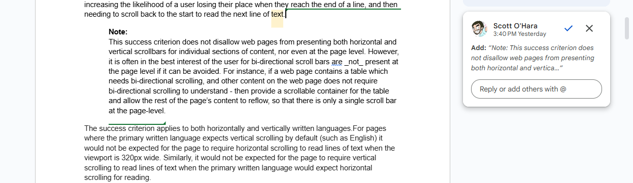
Examples of content which requires two-dimensional layout are images required for understanding (such as maps and diagrams), video, games, presentations, data tables (not individual cells), and interfaces where it is necessary to keep toolbars in view while manipulating content. It is acceptable to provide two-dimensional scrolling for such parts of the content.
Intent
The intent of this success criterion is to let users enlarge text and other related content without having to scroll in two dimensions to read. When lines of text extend beyond the edge of a viewport, users will be forced to scroll back-and-forth to read line by line. This can cause them to lose their place and can significantly increase both physical and cognitive effort. Therefore, most sections of content are expected to reflow within the appropriate sizing requirement defined by this success criterion.
A section of content that requires two-dimensional layout for understanding or functionality, such as a table or map, has an exception to this success criterion. However, sections of content within the two-dimensional layout, such as each cell within a table, would still need to meet this success criterion. Although there is an exception for sections of content that require two-dimensional layout for understanding or functionality, authors can improve the user's experience by making efforts to reduce scrolling for that type of content.
Basic text reflow
The most basic form of reflow occurs on a text-only page. By default, a long line of text will wrap to fit within the available viewport. For text written in left-to-right (LTR) and right-to-left (RTL) horizontal languages, it will wrap within the width of the viewport. For languages that are written vertically, the text will wrap within the height of the viewport.
For pages written in a language where one typically vertically scrolls the page to read (such as English), it is not desired to also need to scroll horizontally back-and-forth to read lines of text. Similarly, users reading content written in a language where one scrolls horizontally to read (such as traditional Chinese or Japanese) it is not desired to also need to vertically scroll back-and-forth to read.
Users who need to enlarge (zoom) text to read it benefit significantly when it reflows. Regardless of the size of the text, it continues to wrap within the visible viewport. A whole line of text is visible, making it easier for the eye to track from the end of one line to the start of the next. Users only need to scroll in the direction of reading to read additional lines of text.
As text is resized, the words wrap so that the text lines do not exceed the viewport. (This quick demo to 200% is not intended to illustrate a test for conformance.)
This criterion requires non-excepted sections of content that are written in horizontal languages reflow when narrowed to a width equivalent to 320 CSS pixels. Similarly, sections of content that are written in vertical languages (which are not as commonly used on the web and so will be used much less frequently in examples) need to be able to reflow when rendered at a height equivalent to 256 CSS pixels.
As the container for the text is reduced in width, the words wrap so that the text lines do not exceed the container width. (This quick demo is not intended to illustrate a test for conformance.)
Reflowing websites and web applications
Modern websites and applications commonly employ responsive web design best practices to adjust or relocate sections of content to fit within smaller viewports. Neither adjusting or relocating content is considered a loss of information or functionality, so long as users are still able to access the content. When content can fit within smaller viewports it not only helps those using mobile devices to read content. It also helps people who need to resize or zoom in a web interface on larger devices, as is the intent of this success criterion.
Adjusting content into a single column
A common way for many article-driven web pages to meet the Reflow success criterion is to ensure that the presentation of a web page can adjust to a single column of content, fitting into a 320 CSS pixel wide viewport and only requiring a user scroll vertically to read the content of the web page.
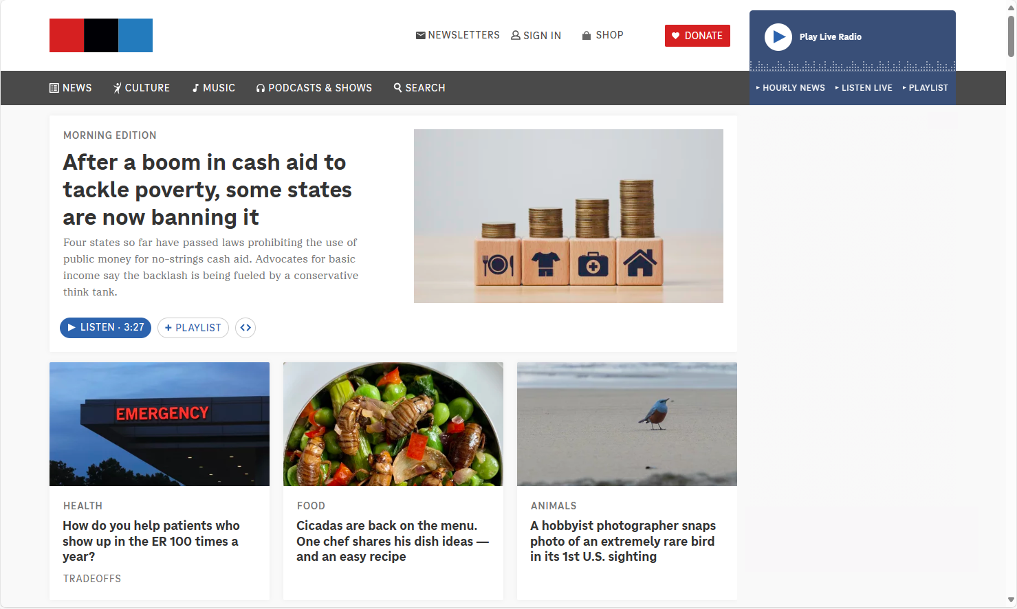
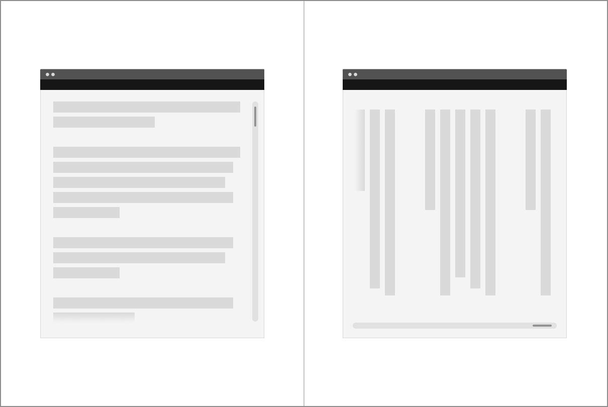
At a default browser zoom and desktop display resolution, a news site shows snippets of news teasers, ads, and other multimedia widgets as distinct sections of content. These sections can vary in size and arrangement to fit the web page design, but each section can be read and interacted with on its own without relying on the visual layout or other sections of content to be understood.

The news site layout adjusts to fit different viewport sizes, whether from resizing the browser or using its zoom features. As the web page layout adjusts, the sections of content stack vertically, allowing for scrolling in one direction to read. The main navigation is hidden behind a hamburger menu button, and the media player is moved and simplified to stay visible without blocking the page content.
A "stacking into a single column" approach will work for many web pages whose primary objective is to present sections of content for people to read, such as articles with tangential sidebars, or home pages that present distinct sections of teaser content in a visual grid or masonry layout - where these layouts are not essential to the understandability of the content. However, this approach may not work for all instances of common, but complex, widgets and layouts which would become more difficult to visually understand or interact with if they were simply stacked to fit in a single column layout.
Content that can benefit from two-dimensional layout for meaning or functionality
Building complex web interfaces will often involve incorporating complex layouts and widgets which often need modified layout, functional adjustments or both when content is enlarged.
Conforming to this success criterion doesn't mean all sections of content need to stack in a single column within smaller viewports. Nor does it require all sections of content scroll in a single direction, so long as each can be read without two-dimensional scrolling to read the lines of text they present.
Although the following examples could be designed to work without horizontal scrolling, they have been designed to demonstrate conforming to the success criterion.
Nested lists or code formatting
Lists and blocks of code often rely on indentation of text to visually convey hierarchy and meaning. If the indentation were to be removed, then meaning or functionality could suffer. For instance, the nesting of unordered list hierarchies would become more difficult to notice if indentation were removed. Additionally, maintaining indentations and non-breaking lines can be important to help understand code patterns, if not even necessary for the code to function.
See technique: G224: Accounting for meaningful text indentation and Reflow for additional details.
Carousels and carousel-like widgets
Within vertically scrolling web pages, implementations of carousels can allow for horizontal scrolling of their content. As the carousel scrolls, a new carousel panel or panels are displayed within the visible viewport. As long as each individual panel within the carousel can fit within a 320 CSS pixel viewport, then a user need only scroll in a single direction to read an individual panel's content.
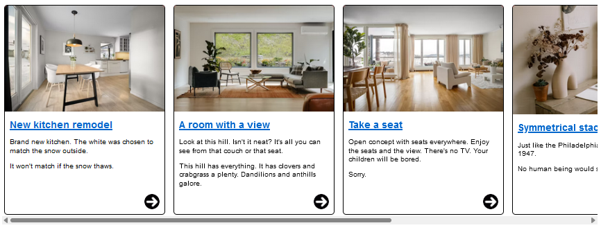
Pass: A carousel presents different panels of teaser content about homes for sale. The carousel container scrolls horizontally, independent of the vertical scrolling of the primary web page. Each individual panel within the carousel is designed to be read vertically, following the direction of reading (top to bottom) of web page's content. When enlarged, each panel can fit within the 320 CSS pixel viewport.
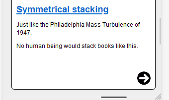
Fail: In this modified version of the previous carousel, the second panel's content does not fit within the 320 CSS pixel viewport.
See technique: G225: Section panels that scroll horizontally are designed to fit within a width of 320 CSS pixels on a vertically scrolling page for additional details.
Two column presentation of editing changes
Being able to review differences in code, or text, side-by-side can be an instance where a scrolling two-column layout can benefit users.
Pass: An interface to review code/document changes provides a two-column comparison between the original and modified content. Each column fits within a 320 CSS pixel wide container and a horizontal scrollbar can be used to position each column into the visible viewport.
An alternate view can show each changed line stacked on top of each other, but the two-column comparison view allows for direct comparison between original and modified lines of code on the same horizontal plane. This can be easier for some users to understand, especially when changes span multiple lines, reducing the need for vertically scrolling between each original and changed block of content.
Content that meets exceptions for Reflow
For many traditional web pages, where the page's primary goal is for users to read distinct sections of content containing multi-line paragraphs of text, the web page commonly scrolls vertically (when written in western languages). People with low vision might need to zoom in the web page to read its content. When they do this using browser zooming the content becomes larger, but the viewport size decreases.
Not all content can fully reflow into smaller viewports without degradation of information or functionality. As already mentioned, this includes tabular data, graphics, maps, presentations, interfaces that require persistent toolbars for use, and two-dimensional layouts where consistent orientation to related sections of content is important for understandability, functionality, or both.
Understanding the scope of exceptions
If a section of content meets the exception for two-dimensional scrolling, the exception only applies to that section. When a section of content is excepted from Reflow, the exception does not automatically extend to other content that doesn't need two-dimensional scrolling for understanding or functionality.
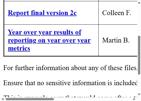
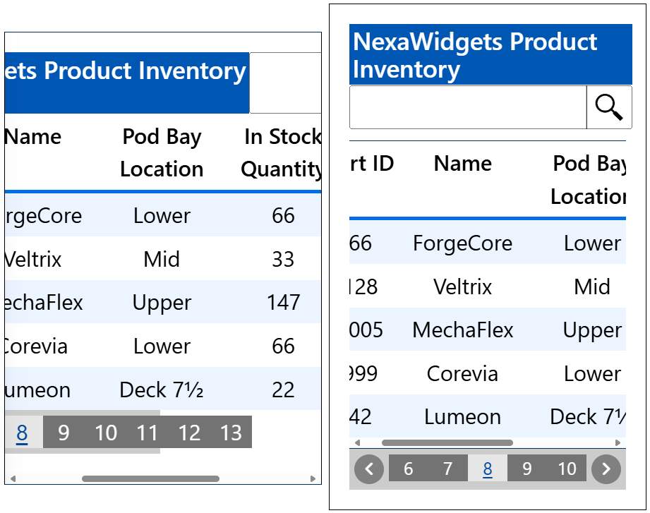
Fail: Due to the way this example was implemented, the web page has both horizontal and vertical scrollbars. While the table meets the exception for two-dimensional layout for understanding, the paragraphs following the table in the screenshot do not.
A data table relies on two-dimensional layout for understanding, but by presenting the table in its own scrollable container it allows other content which does not meet a two-dimensional layout exception to reflow as its containing element adjusts. for example, due to browser resizing, or zooming.
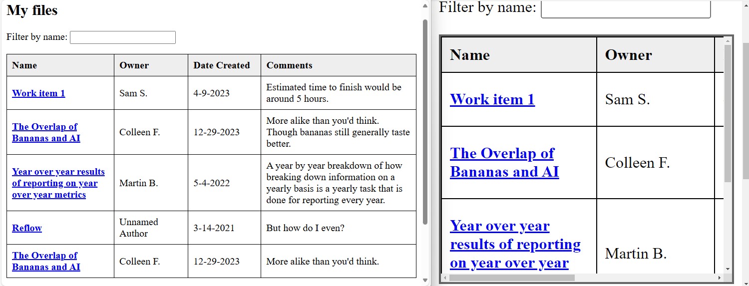
Pass: Tabular data has a Reflow exception. An element that contains a table with a minimum height, width or both, can be styled to provide bidirectional scrollbars allowing a user to scroll the table's content and mitigating bidirectional scrollbars appearing at the page level. On the left, a web page at default zoom shows a table of four columns represents the files a user has access to. On the right, the web page is zoomed in and the table is rendered within a containing element with is own bidirectional scrollbars.
There can be instances where two-dimensional excepted content extends beyond the visible viewport, causing the entire page to scroll. At the same time, other non-excepted content on the same page reflows within the visible viewport. Unlike the prior table example with the paragraph not reflowing, such a situation does pass. Reflow does not prohibit web pages from presenting both horizontal and vertical scrollbars for individual sections of content. Nor does it disallow the use of bidirectional scrollbars at the page (viewport) level in order to support the viewing of excepted content, so long as the non-excepted content only needs scrolling in one direction.
Whenever possible it is in the best interest of the user to limit two-dimensional scrolling only to the individual sections of content which necessitate such scrolling, rather than allowing the page at large to scroll in two dimensions. For example, an unnecessary horizontal scrollbar could lead a user to believe there is content existing off-screen for them to scroll to. But if that scrollbar appears only because of one instance of excepted content, a user could expend effort looking for other non-reflowing content which doesn't exist.
Pass: A video player without a max-width: 100% CSS property causes it to remain full-sized at smaller (zoomed in) viewports. The rest of the page content reflows within 320 CSS pixel wide container. So, while there is a large horizontal scrollbar at the page level, it is due to the video player which has a reflow exception. Unlike the prior table example where the page was implemented in a way where paragraphs extended off-screen and required two-dimensional scrolling to read, this scenario passes because all non-excepted content reflows. However, this does not provide the best user experience, and ideally the styling of the video player would be updated to mitigate the otherwise unnecessary horizontal scrollbar.
Pass: By providing the video player a max-width: 100% CSS property, the video fits within the container element. A horizontal scrollbar no longer appears on the page, thus mitigating any expectation that content, beyond the video, might be present outside of the visible viewport.
Graphics, video and other fixed-dimension media
Graphics and video are by their nature two-dimensional. Slicing up a graphic (photograph, drawing, graph, etc.) and stacking the blocks would make the graphic difficult to understand, if not rendering it unintelligible. However, it is possible to have these elements stay within the bounds of the viewport even as other content zooms to 400%.
Please review the advisory technique C37: Using CSS max-width and height to fit images for more information.
Tabular data and grid-based UI
Data tables and grids have a two-dimensional relationship between column and row headers and their data cells. This success criterion therefore has exceptions for data tables and grids from needing to display without scrolling in the direction of text. However, individual cells would still need to meet Reflow - unless the cell contains content that also requires two-dimensional layout for usage or meaning.
The exception for tables and grids covers content beyond what typically is considered "tabular data". For example, an "electronic program guide" is a type of grid used to display media programs to stream online. It might be presented alongside other content outside of its grid-based layout. The individual cells of the program guide containing information about how to watch and poster art would be expected to fit within the required width or height.
Other content that is related to the table or grid, such as a preceding heading, a search field, or an accompanying pagination to load different sets of data are not excepted from meeting Reflow. For instance, while a table may require two-dimensional scrolling to maintain its understandability, a heading or paragraph that introduce the table, or a search field and pagination component that allow users to search for or navigate to different "pages" of table content are not extended this exception. They would still be expected to adjust to smaller viewports, so as to reduce the need for users to unnecessarily scroll the UI to find and interact with the non-excepted content.
Fail: on the left, a table is not rendered within its own scrollable container. The implementation of the interface did not consider people needing to zoom to read, and thus adapting for smaller viewport sizes. Two-dimensional scrollbars are used to scroll the entire viewport, and some content does not render properly, becoming difficult if not impossible to use.
Pass: On the right, a table is preceded by a heading and search input, and followed by a pagination component, all within the visible viewport. The table is excepted from Reflow, and is rendered within a scrollable container. The heading and pagination are not excepted, and have been adjusted to fit within a zoomed in viewport.
Interfaces with persistent toolbars
Interfaces which provide toolbars to edit content need to show both the content and the toolbar in the viewport. Depending on the number of toolbar buttons, the toolbar may need to scroll in the direction of text, or might even need to remain fully visible and scroll along with the rich text content or editable canvas area that it provides features for editing.
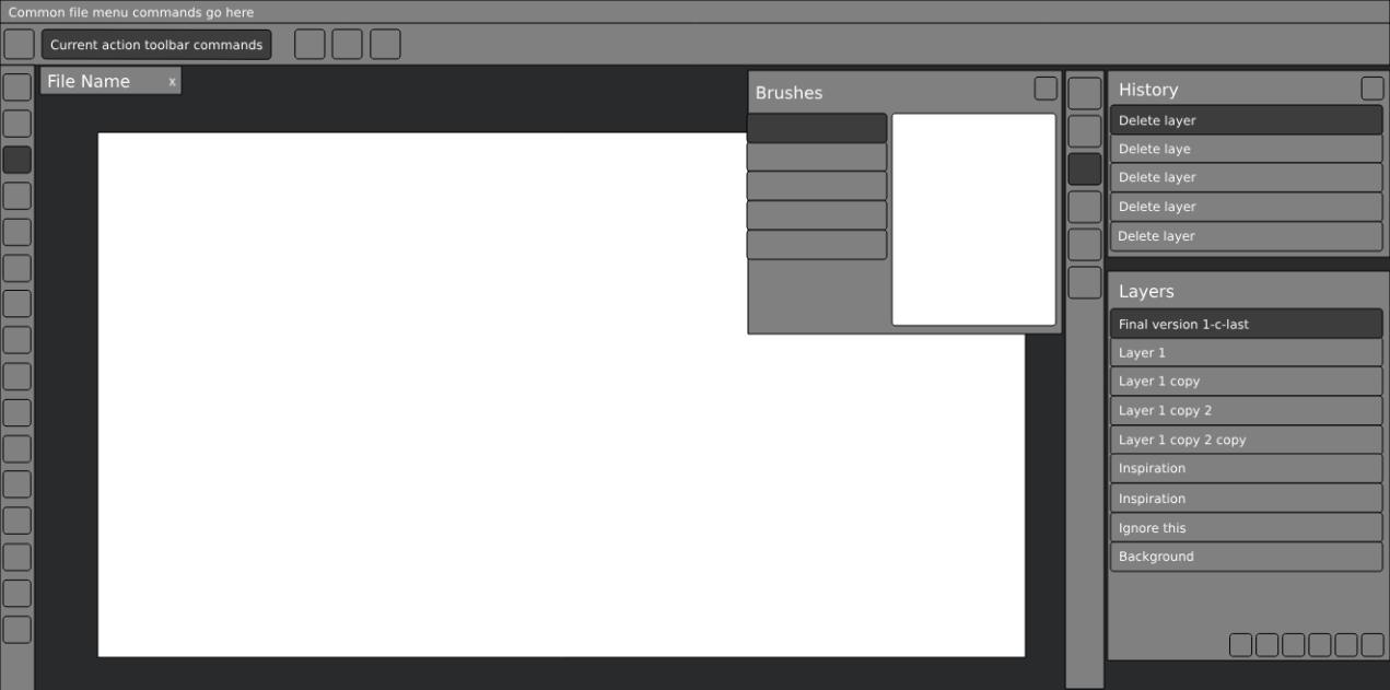
Pass: a photo editing interface presents a fixed-size canvas area, and persistent toolbars, panels and dialogs of controls to manipulate the editable image canvas. The panels and dialogs are resizable and can be made to fit within a 320px wide viewport.
Layout needed for usage and meaning
Complex web application interfaces allow users to create content set to defined dimensions. For instance, presentations or documents can be based on physical printing or display sizes. Complex interfaces often allow for content to be created that is directly related content to, but not a part of, the primary author-created content. For instance, presentation notes, editing comments/suggestions for a text document, dynamic messaging presented along with a message (chat) interface, etc. Each of these related sections of content often need to be presented in parallel to each other, and their understandability can diminish if their overall location were to change.
A rich text document is presented at the height and width dimensions which represent how the page would be formatted if physically printed. Some text is highlighted, indicating it has a comment associated with it. This comment (a related section of content) is located to the side of the rich text document in its own column. This comment does not need to maintain a specific height or width since it only exists as part of the editing interface. Therefore, this comment is expected to reflow so that it can fit within a 320 CSS pixel wide viewport, while the rich text document can maintain its necessary height and width.
Rendering the comments inline with the text of the document would alter the presentation of the dimension-specific layout, as the comments are meant for the authors of the document, and are not to be printed.
Bidirectional scrollbars would be needed to ensure someone can horizontally scroll between the rich text document, to the column of comments.
Finally, interfaces which represent the creation of or rendering of presentations created by users (for instance, creating or presenting slide decks) often cannot simply reflow content, as doing so could easily result in breakages to the presentation of the author's content.
Instead, it would be expected that such interfaces provided content authors with a means to create an alternative presentation that does meet the requirements of this success criterion.
Why specifically 320px and 256px?
The value of 320 CSS pixels for vertically scrolling content was chosen as a reasonable minimum size that authors can achieve. This value aligned with reported viewport width of small displays of common mobile devices that were available when this criterion was originally drafted. The 320 CSS pixels generally corresponds to a desktop browser window set to a width of 1280px and the browser viewport then zoomed to 400%. It should be noted that 400% applies to the dimension, not the area. It means four times the default zoom level viewport width and four times the default zoom level height.
A letter of the same CSS pixel size on different displays with different resolutions
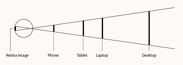
When we read, the size of the print is not as important as the image it projects on the retina of our eye. Phones are designed for close viewing while desktops are designed for viewing farther away. As a consequence, 16px print on a phone is physically smaller than 16px print on a desktop. This is generally not a problem because both print sizes cast the same image on our retina if they are viewed at their intended distance. The CSS reference pixel, the px unit used on the web, reflects this. The CSS reference unit is an angular measurement (1.278 arc minutes), not a length measurement. Most older people, and some people with low vision hold their phone closer than is typical, but again, by using the CSS reference pixel, developers (and designers and content authors) have stable metrics for their design choices.
Acknowledging viewport vs resolution discrepancies
As technology and user interaction with technology evolves, adhering to Reflow becomes less about if there is a specific resolution or browser zoom level that neatly aligns with the sizing requirements of this success criterion, but rather that sections of content can be presented in a viewport equivalent to those sizing requirements. For instance, someone with a browser window docked to one half of their display could have a viewport width of 960 CSS pixels. A user could then zoom the browser 300% and achieve a viewport of 320 CSS pixels wide.
Additionally, not all users who can benefit from Reflow will be viewing web pages at a screen resolution that neatly zooms to either of Reflow's sizing requirements. Rather, an operating system's display resolution and the size of one's browser viewport will commonly not align. For instance, if one were to set their desktop computer's display resolution to 1280 by 1024 pixels, the browser's viewport would be smaller than these dimensions since the operating system and browser UI would detract from the available screen real estate. Some operating systems might not even provide a display resolution that neatly scales to the 320 or 256 CSS pixel dimensions, regardless of zoom level.
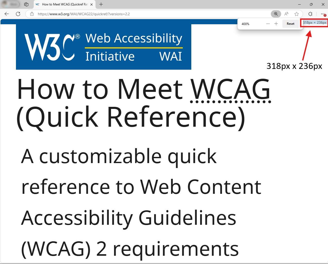
A browser window presented on a laptop with a resolution of 1280 by 1024 pixels. The web page has been zoomed in 400%. However, even with the operating system's taskbar set to auto-hide, and a minimalist amount of browser UI, the viewport is smaller than what one might initially believe without understanding this difference. The viewport is 318 pixels wide due to the browser needing to present the page's vertical scrollbar. The viewport is 236 pixels tall due to the browser's tabs and address bar UI taking up their own vertical space.
Not all user agents will support this SC's normative sizing requirements
An important factor in being able to support Reflow is for a user agent to allow the adjustment of content within specific windows of content, if not the size of the window itself. When Reflow was originally drafted, most mobile operating system browsers handled content zooming and reflow differently than on traditional desktop browsers. For instance, the content of a web page could reflow only when the mobile device's orientation changed. This was because for many mobile browsers at the time, zooming a web page was more of a magnification feature. “Pinch zoom” gestures or double-tap to enlarge would magnify the web page content, allowing a user to then swipe or drag the web page so portions of it could be visible by the magnified screen.
These days, more browsers on mobile devices or other devices that allow users to open applications at fixed dimensions (e.g., full screen or split screen) allow for scaling features that are more in-line with traditional desktop browser zooming. Or, these devices have incorporated zooming features at the OS level that can allow at least some level of reflowing of content for web pages. Many of these features, however, do not commonly adjust the fixed-dimension browser viewport to the 320 CSS pixel width for vertically scrolling content, or 256 CSS pixel height for horizontally scrolling content.
While one might regard the inability to resize fixed-dimension browsers to the 320 CSS pixel or 256 CSS pixel sizes used by this criterion a user agent support issue, it is not the intent of this criterion to mandate devices need to support these specific sizes for presenting content, nor is it to be assumed that if content cannot be presented within such sizes on specific devices that the web page would pass or fail Reflow. If a web page can be viewed on a device where the sizing requirements of this criterion can be accurately tested, then it is on such devices where a web page's ability to meet Reflow is best to be determined.
Overlap with other success criteria
When reviewing a web page for Reflow, issues related to other WCAG success criteria might be discovered. The following are examples of potential overlaps with other success criteria, though not all overlapping success criteria are mentioned.
Resize Text
The intent of the Reflow success criterion is to ensure that users can resize or zoom into web pages, and when doing so text within sections of content can be read without having to scroll in two directions. Success criterion 1.4.4 Resize Text overlaps with this goal, as it should be possible to increase the size of all text to at least 200% while simultaneously meeting Reflow.
Note
If zooming in a web page by 200% results in a viewport that is smaller than the sizing requirements of Reflow, then two-dimensional scrolling may occur. This would not be a failure of Reflow, as the sizing of the viewport would be smaller than what Reflow requires.
For many web pages, the text of the page is expected to continue to enlarge as the browser magnification increases, so that users can magnify text up to (and beyond) 400%. In an implementation where text does not consistently increase its size as people zoom in (such as when it is transformed based on a media query to adapt to small-screen usage), it must still be possible to get to 200% enlargement to satisfy the Resize Text criterion. It is important to note that while the intent of Reflow will commonly result in the enlargement of text, Reflow does not specifically require any text size enlargement be reached. There may even be instances where one needs to prevent some text from becoming too large, thus mitigating the potential of unwanted two-dimensional scrolling.
For example, if at the default browser setting of 100% zoom, text is set at 20px when the window is 1280 CSS pixels wide, at 200% zoom it will visually appear at twice the size. After zooming by 400% the page reflows to fit within the 320 CSS pixel viewport, the author may decide to set the page's text size to 10px. The text is now half the original size in CSS pixels, but as it has been enlarged to 400%, so it is still displayed at twice the size compared to the default browser setting of 100% zoom. It is not required to achieve 200% text enlargement while remaining inside a specific breakpoint (as zooming may result in the variation for a new breakpoint becoming active), but it should still be possible to get 200% text enlargement in some way compared to the default 100% zoom.
Focus Not Obscured (Minimum)
When sections of content have been designed to be fixed position or “sticky” at larger viewport sizes, authors need to ensure such sticky content does not fully obscure the element which has user keyboard focus, or in the case author created content does obscure content, there is a way for a user to dismiss the obscuring content without requiring the advancement of keyboard focus. Such sticky or fixed content can pose significant issues for those who would benefit from Reflow, as aside from obscuring keyboard focus, such sticky or fixed content can make reading content difficult if not impossible.
For example, a website's content properly reflows to fit within a 320 CSS pixel wide viewport. The website also displays fixed-position ads. The ads are often presented in a lower corner of the web page when rendered in larger viewports. However, when attempting to zoom in the page, the ads remain in their fixed position. They obscure not only the focusable elements of the page, providing no way to dismiss the ad without finding / keyboard navigating to its close button, but significantly reduce the available space for reading.

The fixed position advertisement not only obstructs the hyperlink that has keyboard focus, but significantly limits the available space to read the content of the web page.
Making the advertisement's positioning static, the reflowed content of the web page can be read, and the advertisement (not shown in this screenshot) can still be viewed when scrolling the page.
Note
Beyond this sticky advertisement example, commonly toolbars, menubars, navigation and other "sidebar" content may be presented with sticky or fixed positions at larger viewport sizes. It is strongly suggested that at smaller viewport sizes that such components are modified to have static positioning, or their display can be toggled by the user. Doing so will help ensure the zoomed in content can be read by users, as the sticky components will no longer obstruct the view of the web page's content.
Examples
-
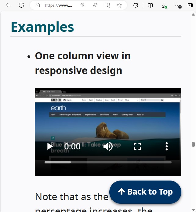
One column view in responsive design
Note that as the zoom percentage increases, the navigation changes first to hide options behind a "More" dropdown menu. As zooming continues, most navigation options are eventually behind a "hamburger" menu button. All the information and functionality is still available from this web page. There is no horizontal scrolling.
-
PDF offering reflow
In a PDF created to conform to PDF/Universal Accessibility (ISO 14289), the content can be reflowed and zoomed in to make reading possible for someone with low-vision.
-
Alternative presentations to truncating content
A web page presents long strings of text which are truncated to save space. E.g., user generated content that does not fit into the space allocated for the interface's design, or authentication keys which do not wrap, etc.. The content is presented as truncated, but a link is provided to a web page where the content is fully visible without truncation, or a mechanism is provided on the web page to reveal the truncated content.
-
Preformatted text conveys meaning
The presentation of text where the layout has specific meaning, such as code indentation for Python or "ascii art" as just two examples, would lose meaning if the layout were not presented correctly. This success criterion does not apply where that meaning would be lost. However, this is not the case for most other instances of text where text wrapping can be applied without loss of meaning. Additionally, for instances of indentation that convey meaning, consider reducing the size of the indentation at zoomed in levels. As the text will be bigger, the reduced indentation width can still be noticeable.
Related Resources
Resources are for information purposes only, no endorsement implied.
- Reading with Low Vision in a Digital Setting: by Wayne Dick, PhD.
- Operational Overhead Caused by Horizontal Scrolling Text by Wayne Dick, 2017. The study shows the impact of horizontal scrolling on reading effort
- Accessibility Requirements for People with Low Vision. W3C First Public Working Draft 17 March 2016
- Responsive design resources from MDN Web docs
- Responsive web design basics tutorial from Google
Techniques
Each numbered item in this section represents a technique or combination of techniques that the WCAG Working Group deems sufficient for meeting this Success Criterion. A technique may go beyond the minimum requirement of the criterion. There may be other ways of meeting the criterion not covered by these techniques. For information on using other techniques, see Understanding Techniques for WCAG Success Criteria, particularly the "Other Techniques" section.
Sufficient Techniques
- C32: Using media queries and grid CSS to reflow columns
- C31: Using CSS Flexbox to reflow content
- C33: Allowing for Reflow with Long URLs and Strings of Text
- C38: Using CSS width, max-width and flexbox to fit labels and inputs
- SCR34: Calculating size and position in a way that scales with text size
- G206: Providing options within the content to switch to a layout that does not require the user to scroll horizontally to read a line of text
- G224: Accounting for meaningful text indentation and Reflow
- G225: Section panels that scroll horizontally are designed to fit within a width of 320 CSS pixels on a vertically scrolling page
- Using PDF/UA when creating PDFs (Potential future technique)
Advisory Techniques
Although not required for conformance, the following additional techniques should be considered in order to make content more accessible. Not all techniques can be used or would be effective in all situations.
- C34: Using media queries to un-fixing sticky headers / footers
- C37: Using CSS max-width and height to fit images
- CSS, Reflowing simple data tables (Potential future technique)
- CSS, Fitting data cells within the width of the viewport (Potential future technique)
- Mechanism to allow mobile view at any time (Potential future technique)
- Alternate view supporting Reflow for otherwise excepted content (Potential future technique)
Failures
The following are common mistakes that are considered failures of this Success Criterion by the WCAG Working Group.
Key Terms
- assistive technology
hardware and/or software that acts as a user agent, or along with a mainstream user agent, to provide functionality to meet the requirements of users with disabilities that go beyond those offered by mainstream user agents
Note 1
Functionality provided by assistive technology includes alternative presentations (e.g., as synthesized speech or magnified content), alternative input methods (e.g., voice), additional navigation or orientation mechanisms, and content transformations (e.g., to make tables more accessible).
Note 2
Assistive technologies often communicate data and messages with mainstream user agents by using and monitoring APIs.
Note 3
The distinction between mainstream user agents and assistive technologies is not absolute. Many mainstream user agents provide some features to assist individuals with disabilities. The basic difference is that mainstream user agents target broad and diverse audiences that usually include people with and without disabilities. Assistive technologies target narrowly defined populations of users with specific disabilities. The assistance provided by an assistive technology is more specific and appropriate to the needs of its target users. The mainstream user agent may provide important functionality to assistive technologies like retrieving web content from program objects or parsing markup into identifiable bundles.
- CSS pixel
visual angle of about 0.0213 degrees
A CSS pixel is the canonical unit of measure for all lengths and measurements in CSS. This unit is density-independent, and distinct from actual hardware pixels present in a display. User agents and operating systems should ensure that a CSS pixel is set as closely as possible to the CSS Values and Units Module Level 3 reference pixel [css3-values], which takes into account the physical dimensions of the display and the assumed viewing distance (factors that cannot be determined by content authors).
- user agent
any software that retrieves and presents web content for users
- viewport
object in which the user agent presents content
Note 1
The user agent presents content through one or more viewports. Viewports include windows, frames, loudspeakers, and virtual magnifying glasses. A viewport may contain another viewport (e.g., nested frames). Interface components created by the user agent such as prompts, menus, and alerts are not viewports.
Note 2
This definition is based on User Agent Accessibility Guidelines 1.0 Glossary [UAAG10].
Test Rules
The following are Test Rules for certain aspects of this Success Criterion. It is not necessary to use these particular Test Rules to check for conformance with WCAG, but they are defined and approved test methods. For information on using Test Rules, see Understanding Test Rules for WCAG Success Criteria.